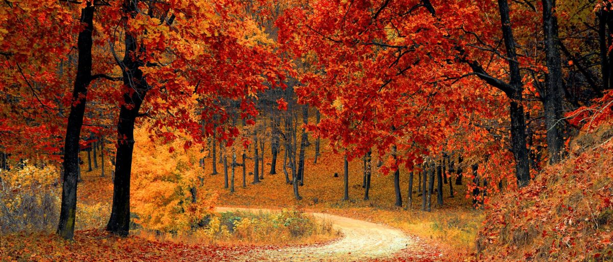
There are so many shades of orange, something that you may not realize until you put on three different articles of clothing and they do not match.
Nature, of course just does what it does. Some years, better than others.
The perfect shade, tone or gradation matters – oh, it matters. Graphic designers know this better than anyone.
There can be is a huge difference between the oranges in a pumpkin, mango or, a Habanero pepper…just as there is an obvious variation in the colors of the Dunkin‘, Orange Theory and Discover logos – at least to the careful observer.
![]()

![]()
To the average person, the colors of these logos don’t really matter. But, there is a problem for the average person. Especially, especially if they are just trying to blend in with the fall foliage and the tones of the season. In reality, you can only have limited apparel in the shades of orange needed to fully embrace fall, mirroring the colors in nature.
~ Dawn aka Hat Girl